
case study
shipley neuro pediatrics
partnering in your child’s health
In the initial strategy meeting with Shipley Neuro Pediatrics, some key ideas emerged. Visually, it needed to feel soft, compassionate and inviting. It was also important to communicate an idea of long-term healing and recovery focusing on the future and what a new future could look like. Ultimately, the idea of partnering with not only patients, but their families emerged as the key theme that ended up guiding the direction of the logo.
Services:
Logo Identity
Website
the logo
After creating 10 unique logo concepts, we narrowed them down to a few options with a few edits and ultimately decided on this final logo.
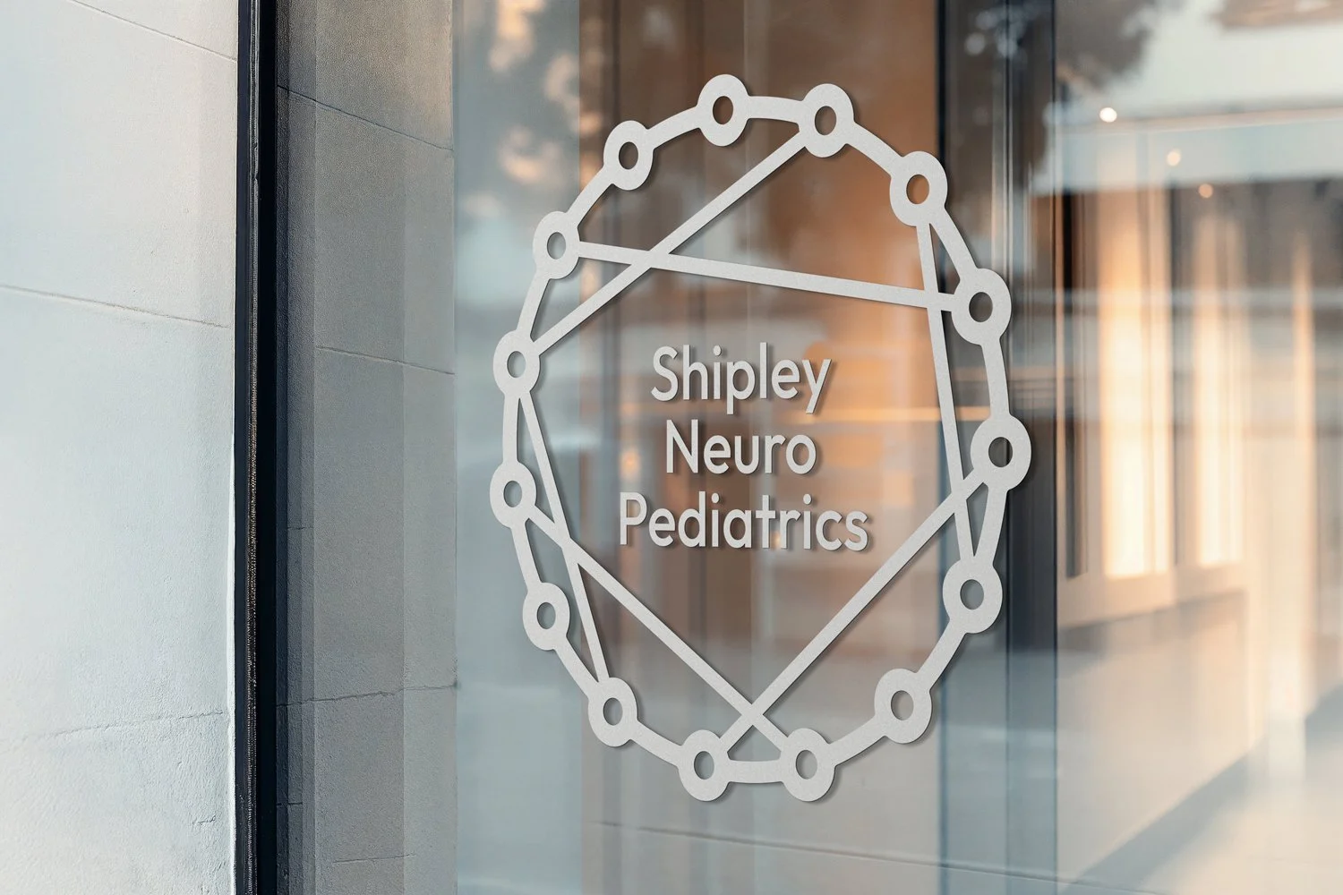
The idea of partnering with families as they walk through treatment was the most important value that the brand needed to communicate through the visual identity, so we landed on this logo featuring a child and a parent hand-in-hand that are made of lines that represent neurological connections. Connection and partnership are represented in two different ways and the logomark shows not only what Shipley Neuro Pediatrics does, but also who they are and what they value.
With a palette made of cool, gentle pastels and a clean, practical typeface the visual identity began to take shape.
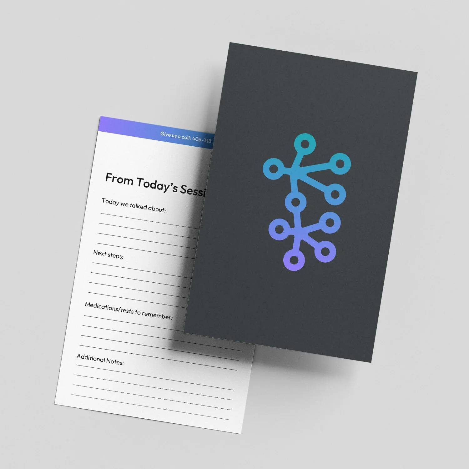
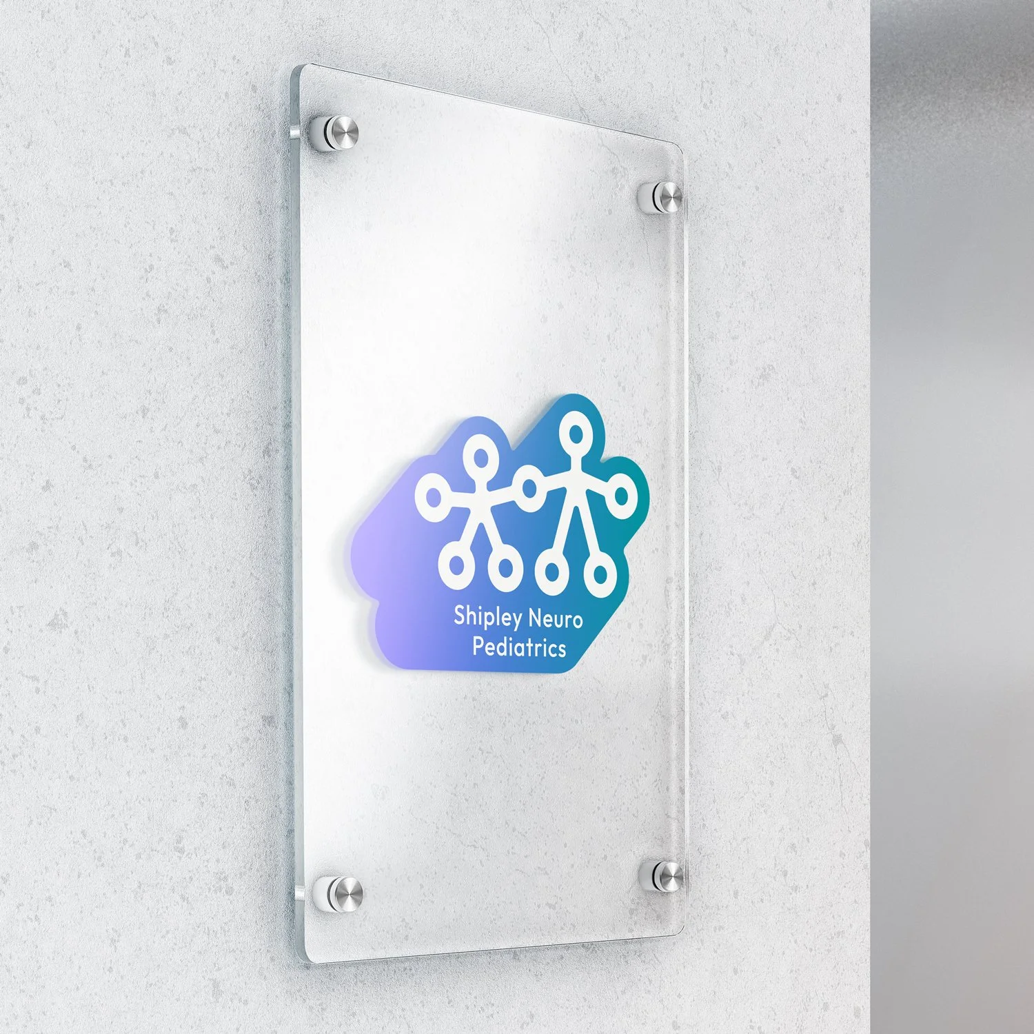
the supporting logo set
Additional logo variations were created as part of the logo package that are to be used sparingly but can fit a wider variety of applications and also introduce thoughtful variations within the branding. They are to be used somewhat sparingly but a sticker and circle version were also created for secondary locations where viewers are already familiar with the brand.
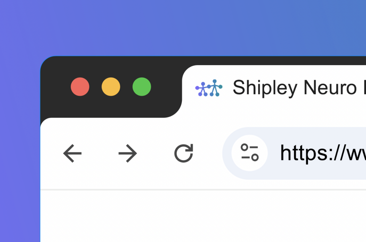
A miniature version was also created to be used at very small sizes such as a favicon. This version keeps all the key details but strips away detail that may have been lost at small scales in order to stay as recognizable as possible.
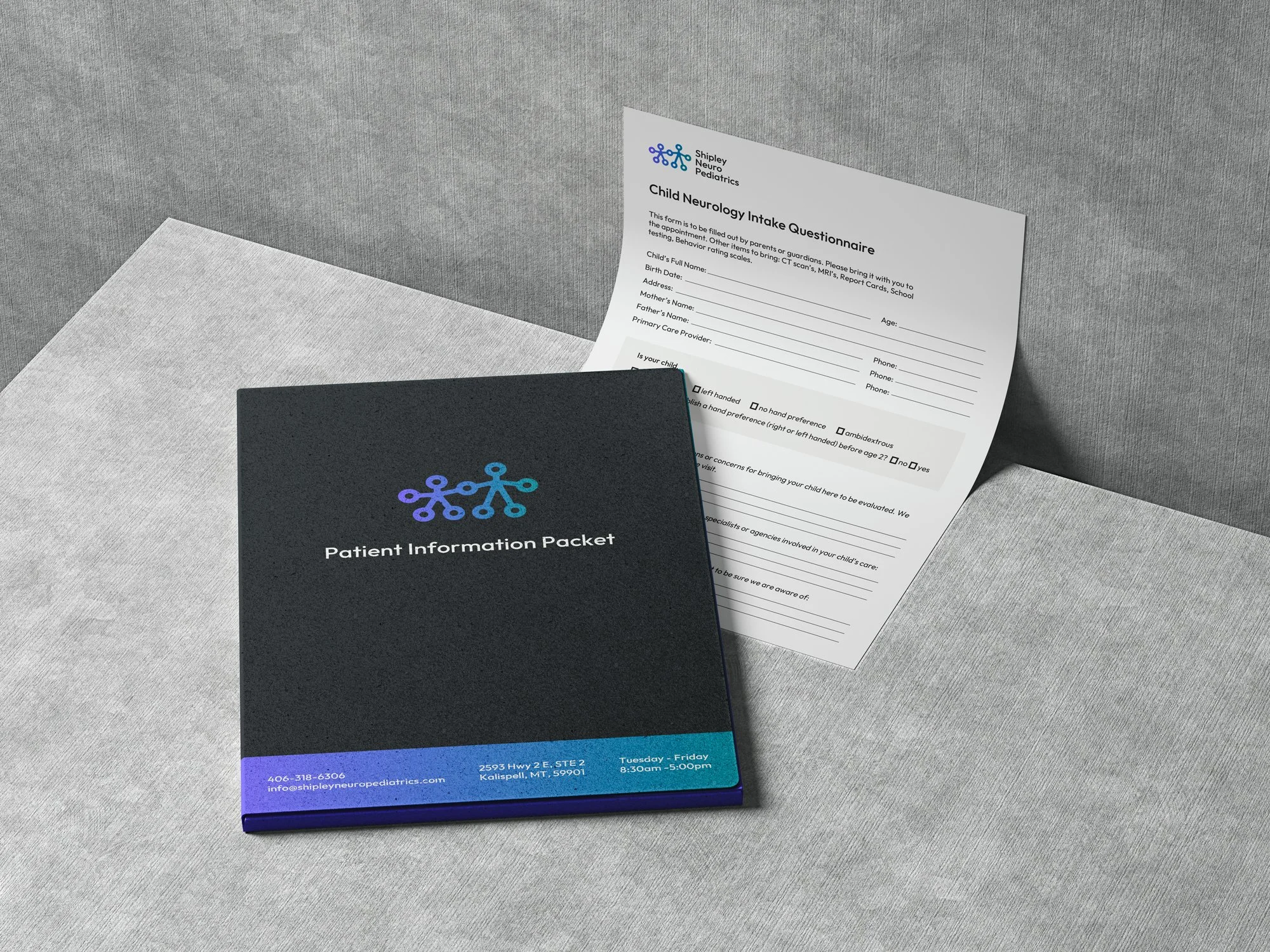
a client-first website
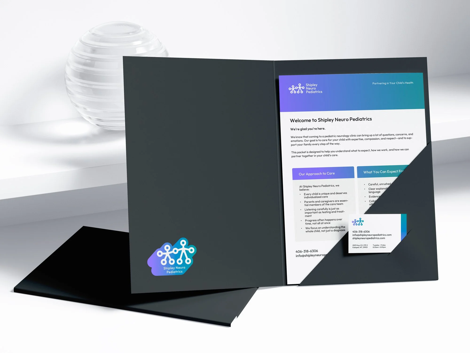
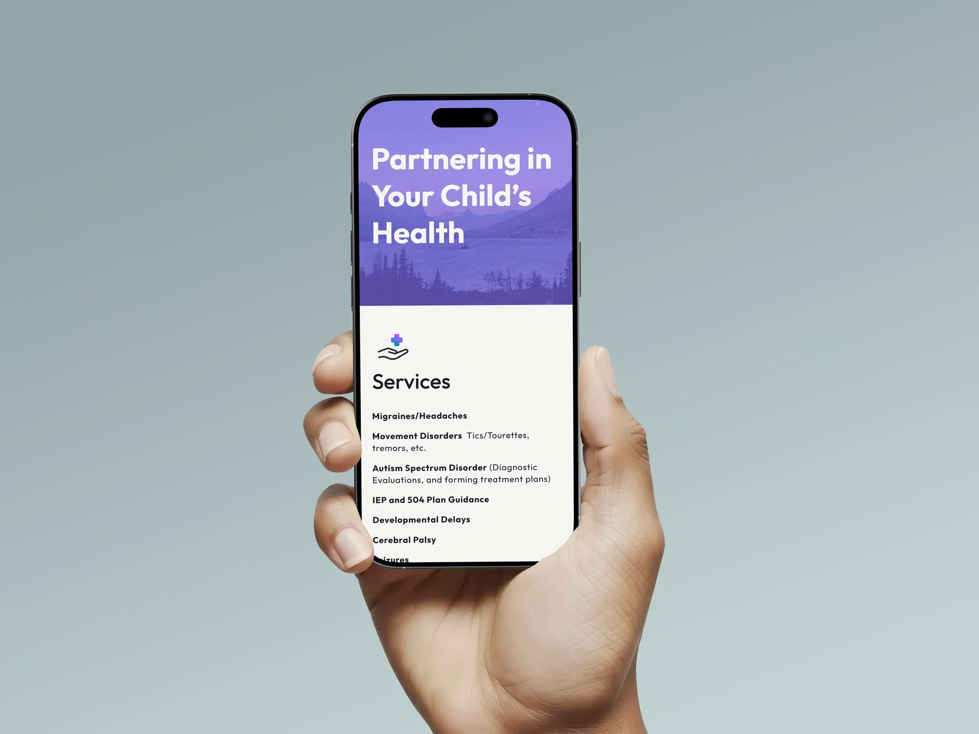
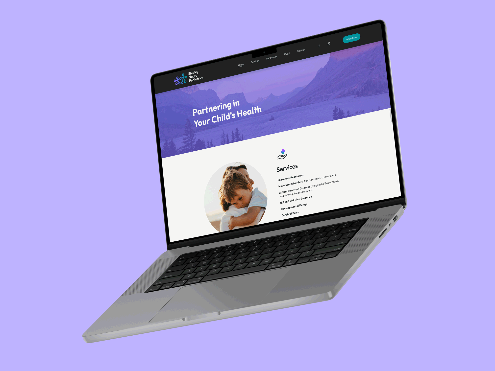
In addition to a logo identity, this website was built to support the practice by improving patient education and reducing friction before and after visits. Clear layouts, intuitive navigation, and thoughtful design help patients and families find what they need efficiently. The goal of the site was to support both patient confidence and clinic efficiency.
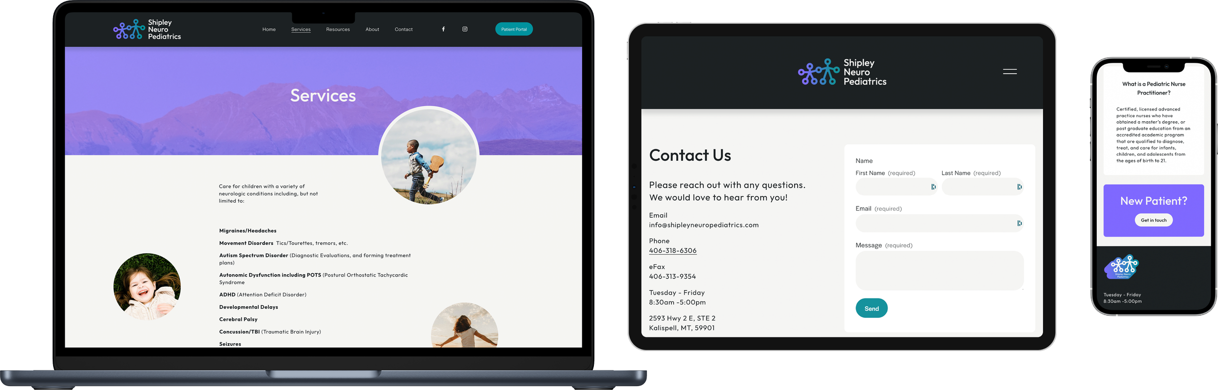
custom iconography
Including thoughtfully branded details like custom icons shows new patients that Shipley Neuro Pediatrics pays attention to even the smallest details and prioritizes clean, effective communication.
services

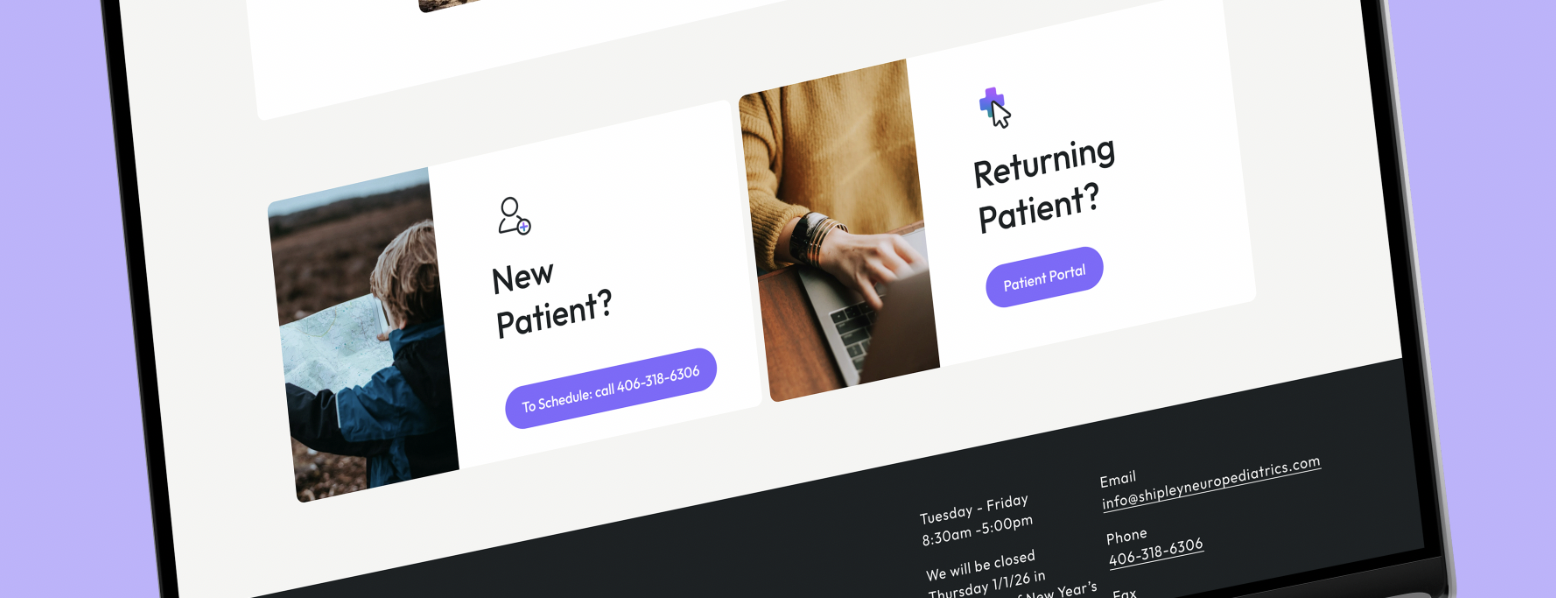
new patient

returning patient

“ Josiah is amazing!! He was wonderful to work with, and had great communication throughout the process of creating my logo, and website for my business. He's very detail oriented, and thorough! “
- Jennifer Shipley.